paola@paolafaoro.com
UI/UX Design
Cherie Blair
BookBuddy
WeatherApp
Design Council
City of Westminster College
Julian Cowie Architects
Justin Bere Architects
Kate Radmilovic
Silver Jungle
Books
The Endless City
Animals in Art
Still Life. Killing Time.
Collins Big Book of Art
Roundhouse
The Eames Lounge Chair
Self Portrait
Van Dyck & Britain
The Lure of the East
Albers and Moholy-Nagy
3 Steel Houses
Artigo Oitavo
Branding & Logos
Think London
City of Westminster College
The Transformation Trust
The Hepworth Wakefield
RIBA The evolution of a brand
RIBA 175
Exmouth Market
Brasil meets Japan
O círculo
Omin
Editorial
Urban Age
Art History Journal
Olympic Park
Migration Index Report
RIBA Annual Reviews
MPG Annual Reviews
Exhibition & Environment
Naples Sundial
The Lure of the East
Roundhouse
Tower Bridge
Grand Designs Live
The Works Ebbw Vale
Music
Mundaré
MÊ e o monstro
Mafaro
Jardim Japonês
Matsuri
Lîla
Couleurs du Temp
Terra Sonora
Água
Música contemporânea
Posters
MÊ e o monstro
Cãocoisa e a coisa homem
n.d.a.
Festival de Antonina
Músicas bem bonitas
Chaumont
Off Music Festival
Poor Little Rich Girl
be data wise
Plic Ploc
Risco
Print
Royal Mail stamps
Self-Portrait Exhibition
Image a Nation Film Festival
Think Architecture
Goodgifts
Wedding Danielle
Wedding Stefanie
Wayfinding
City of Westminster College
Roundhouse
Tower Bridge
| Overview | Main Menu |
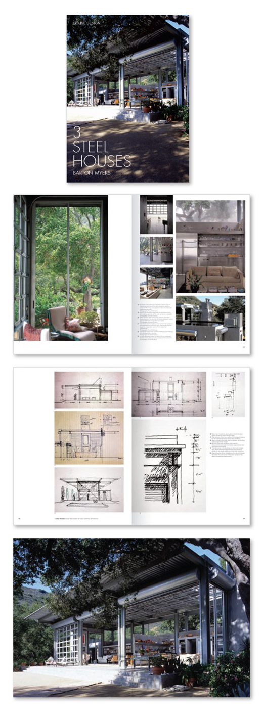
3 Steel Houses
An in-depth study of three residential projects
![]()
![]()
Since 1970 the architect Barton Myers has constructed three custom-designed steel residences and simultaneously developed a flexible prototype for standardised, mass-produced housing. Viewed collectively, Myers' work creatively envisions the potential that mass production, using exposed steel frame construction and standardised off-the-shelf industrial components, can hold for environmentally sensitive design.
This book is a unique, in-depth study of three major residential projects. The typography was inspired by the visual lightness of the buildings and the typeface Futura was chosen for its timeless quality and near-perfect geometry. As a typeface it avoids the decorative, focusing solely on its essential elements. In a way, it is like Myers’ buildings themselves.
Client: Barton Myers
Publisher: Images Publishing
Art Direction and Design